From the AppScreens team
All About Testing: App Store Screenshots That Get More Downloads
You've built an app worth downloading. Can someone tell why they need it just by looking at your screenshots? In this walkthrough, Sammy shows how to make that value clearer, create your screenshot set in AppScreens, and test which changes help people decide to download.
The video follows the whole process, from your first three screenshots and captions to localization, design variants, and App Store Connect uploads. We've written up the advice and case studies below so you can watch the walkthrough or work through it at your own pace.
In short
Put your clearest benefit first, show the part of your app that proves it, and make the next two screenshots give people more reasons to care. Then test an image, caption, background, or screenshot order with your own audience.
Sammy walks through creating and localizing a project, explains what textPlus, Headspace, OLBG, and Coin Splash reported, and finishes with a five-second check you can try before running a live experiment.
Watch the walkthrough
Join Sammy, AppScreens co-founder and product manager, for a walkthrough of clearer screenshots and practical ways to test them in just under 12 minutes. If you're new here, our Meet Sammy interview covers how the screenshot work behind CookBook led us to build AppScreens.
Watch App Store Screenshots That Get More Downloads on YouTube, or jump to a section:
Your first three screenshots need to earn the next swipe
ASO, or App Store Optimization, covers helping people find your app and convincing them to download it. This video focuses on the second part. You may have already spent time creating content or money running ads, but the store page still has to explain why the app is worth trying.
Sammy compares the first three screenshots to a book cover. If they don't give someone a reason to care, the rest of the set may never get seen. Start with your clearest benefit, then use screenshots two and three to show another useful outcome or a reason to trust the app.
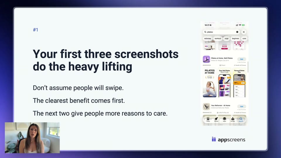
Think of the three-to-seven-second window mentioned in the video as a design prompt. Can someone understand what your app helps them do in a quick glance? Check the screenshots at phone size. If the message needs explaining, simplify it.
The expense-tracking example makes the difference clear. "Advanced expense tracking" names a feature. "Know where your money goes" gives someone a reason to want it. Pair that caption with the part of the app that makes the promise believable. Our guide to screenshots that could be hurting your downloads covers more ways to spot an unclear first impression.
Build one project, then make the changes across your set
The demonstration starts from the AppScreens homepage with Create screenshots fast, then AI screenshot creator. You can search for an app that's already live, select one you've used before, or manually add an unpublished app and describe what it does.
AppScreens uses that information to suggest captions. Sammy reorders and refines them, chooses a food-focused template, selects the output sizes, and adds the real app screens. The captions are a starting point you can edit to fit your app and the people you want to reach.
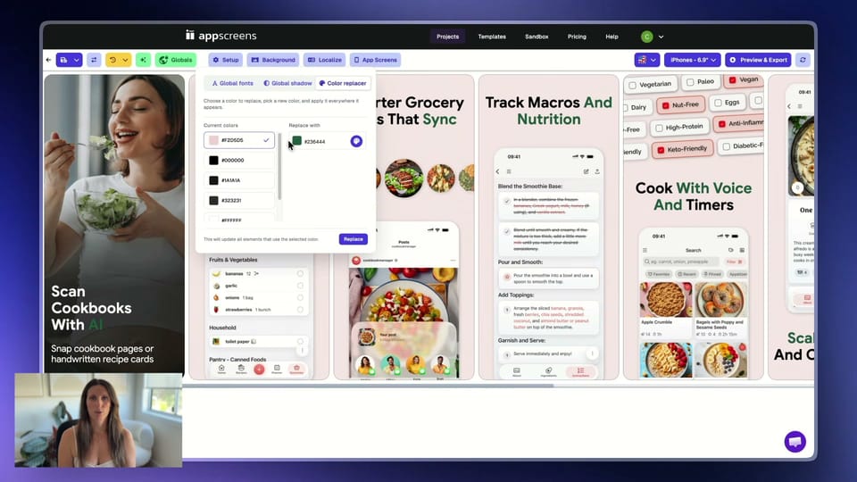
In the designer, she changes colors across the project and applies a device frame across the set. Fonts, shadows, images, badges, and other design elements can also be adjusted. The useful part is keeping those changes together: you can update the project and generate the sizes you need without editing every screenshot separately.
Start with our screenshot templates, or follow the guide to making App Store screenshots if you're preparing your first set.
Make the wording feel familiar in each market
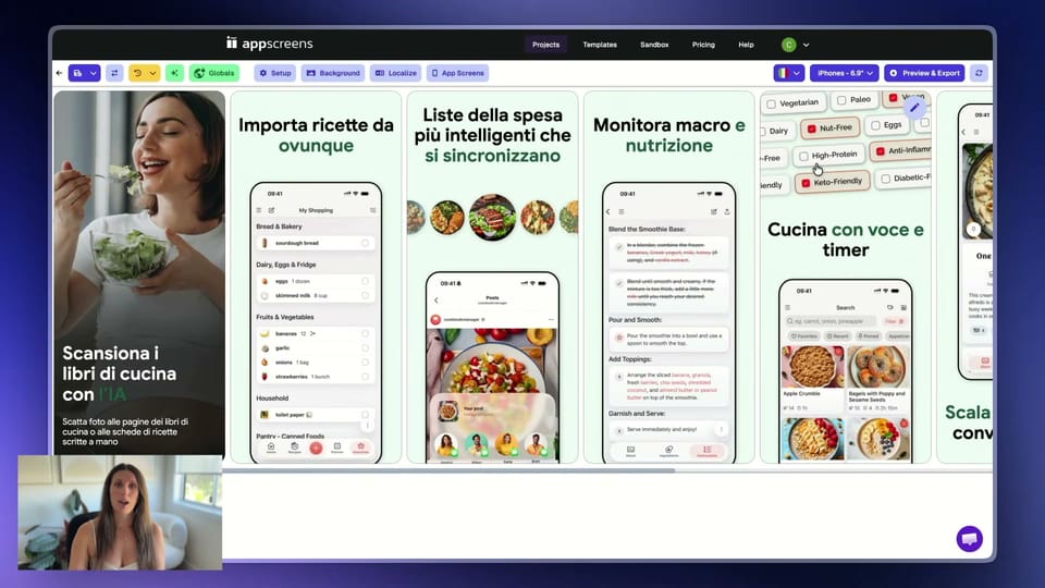
Sammy adds British English, German, and Italian to the project, then uses a small example to explain why localization matters: a grocery list in the US is a shopping list in the UK. It's the same feature, but people describe it differently. Your captions should sound like the words they would use.
AppScreens translates the captions, adapts the layout, and lets you change the app screens or images for each locale. Review each version and use app screens captured in the right language, so translated headlines sit above the matching app interface.
The video mentions Coin Splash as a reason to look beyond your original market. App Guardians reported 101% more global Google Play downloads after 40 days following metadata localization across four languages and six countries. The campaign also doubled spending on paid acquisition, so that result includes more than localization alone and doesn't isolate a screenshot change.
For your own app, choose a market worth supporting and review the wording and images together. Our screenshot localization guide explains the process, and which languages to localize into can help you decide where to start.
What the screenshot tests actually found
Once you have a set, you have something to test. You might love a particular image or background, but your audience may prefer something else. These are the three screenshot-testing examples Sammy walks through.
textPlus: a small image change, a measurable result
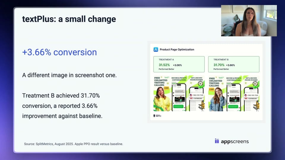
textPlus tested screenshot variations, including different people in the image and badge placement. In the SplitMetrics case study, Treatment B reached a 31.7% conversion rate, with a reported 3.66% improvement against the baseline. The improvement is relative, rather than an extra 3.66 percentage points. For your own test, you could keep the message and layout and change just the image to find out whether it helps more visitors decide to install.
Headspace: keep learning across tests and markets
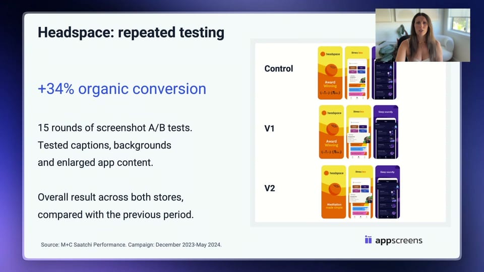
Headspace ran 15 sets of A/B tests, exploring backgrounds, captions, social proof, and how prominently the app's content appeared. M+C Saatchi Performance reported an average 34% increase in organic conversion rate across iOS and Google Play compared with the previous period, during a December 2023 to May 2024 campaign.
That was a campaign result across tests and markets. Short captions, bright backgrounds, and social proof performed well, but the response also varied by market and store. Keep what you learn from each test and use it to choose the next one.
OLBG: the cleaner background lost
OLBG expected a plain background to perform better. It performed 10% to 13% worse than the themed version. Across its screenshot optimization work, OLBG reported a 61% conversion increase, with its largest gain linked to bringing two popular features into the first three screenshots.
It's a useful reminder to test design advice before applying it everywhere. A simpler background may help your app, or it may remove something your audience responds to. These are individual results, not a forecast for your listing. Our ASO and A/B testing guide has more examples and explains how a conversion change affects downloads.
Create a variant with one clear question
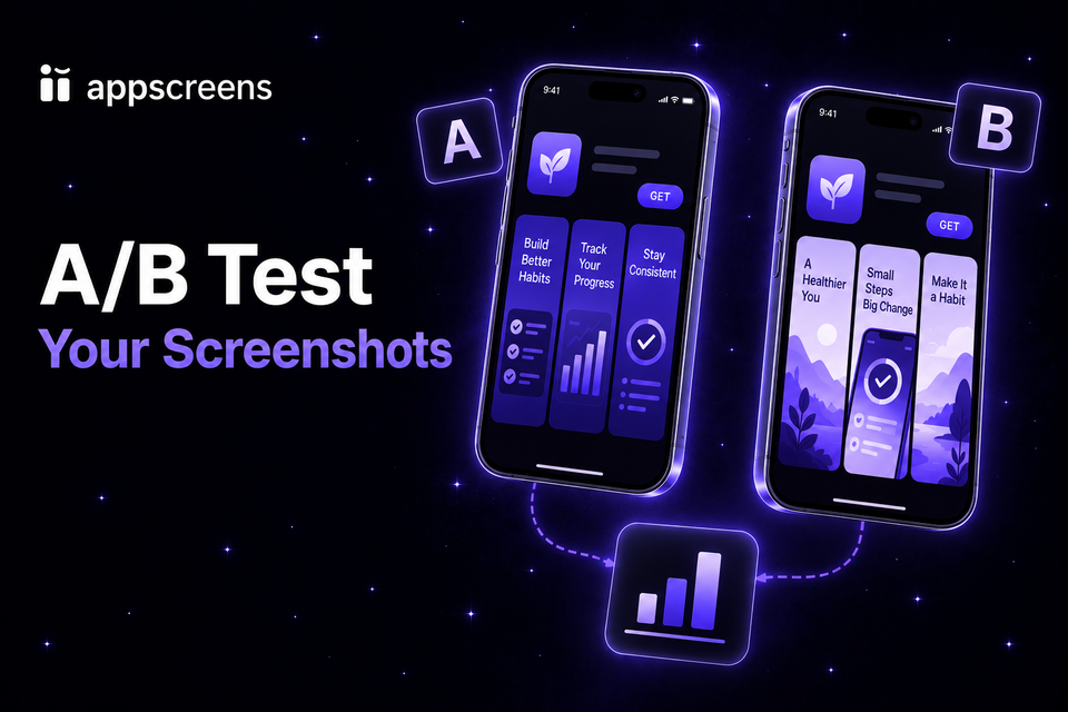
Back in AppScreens, Sammy keeps the original project as the control and creates a second version with a different image in screenshot one. Everything else stays the same. The question is simple: does this image persuade more people to download?
She then demonstrates other changes you can prepare: move a screenshot earlier in the set, try a new caption, change the panoramic background color, or apply a template or saved preset. To try a caption, select the text, open the AI button, and choose a suggestion. You can regenerate the options if they don't fit. Each gives you another idea to test without starting the project again.
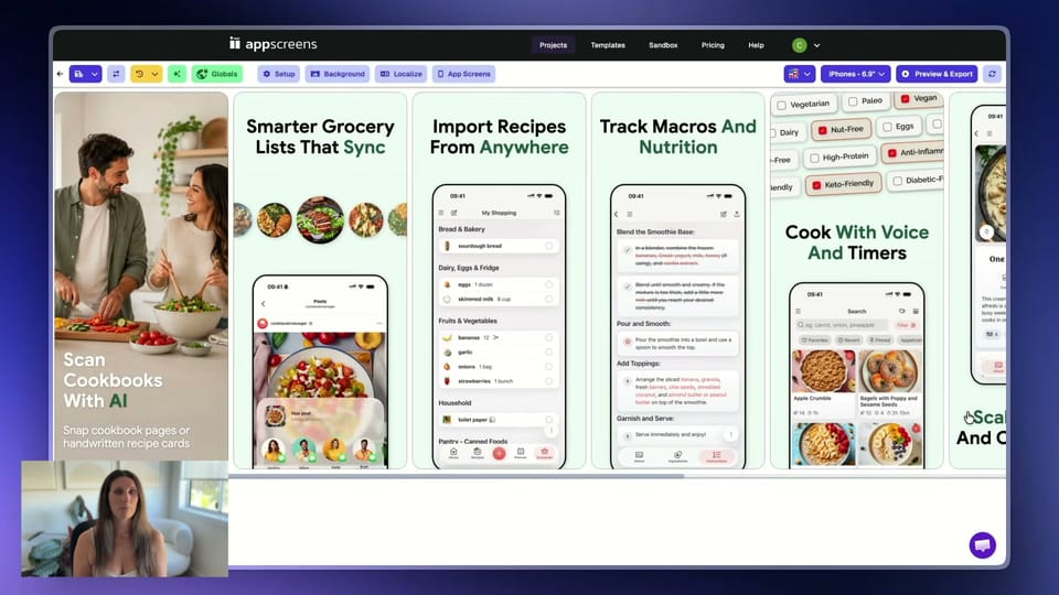
You can also test a whole new design. Just be clear about what the result tells you. If the images, captions, and background all change together, you'll learn which set performed better, but you won't know which individual change caused it.
When the assets are ready, AppScreens can upload screenshots directly to App Store Connect and Google Play. For iOS, that includes Product Page Optimization treatments and Custom Product Pages. Use Product Page Optimization to compare variations of your default page. Custom Product Pages let you tailor the listing to a particular audience or campaign. For Android, see our guide to Google Play Store Listing Experiments.
Give the experiment enough data before picking a winner. A lead on day one can disappear. If you're launching and don't have enough traffic yet, start with feedback from likely users, improve the message, and run a live test when you can.
Try the five-second check before your next test
Sammy finishes with a checklist you can use on the screenshots you already have:
- Keep one message per screenshot. Decide what someone should understand and remove anything competing with it.
- Keep captions short and focused on the benefit. Use words your audience would use and check that they're comfortable to read on a phone.
- Include genuine social proof when you have it. A useful review, rating, or credible award should be accurate and readable.
- Show the part of the app that proves the point. A close-up can explain a feature more clearly than a whole screen. Keep it faithful to the actual app.
Now show your first three screenshots to someone who could actually use your app. After five seconds, hide them and ask: "What does this app help you do? Why would you use it?" If they can't answer, make the message clearer and try again.
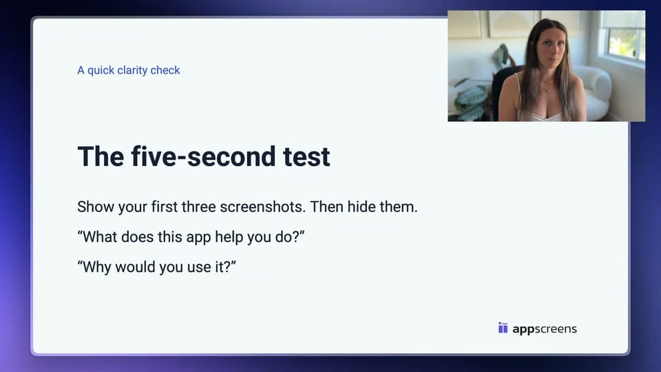
This is a quick clarity check before you measure conversion with a live audience. Start with those first three screenshots, make the benefit obvious, and choose one change to test next. You can build your set from an AppScreens template or get a screenshot review to help decide where to focus.