
ASO workflow
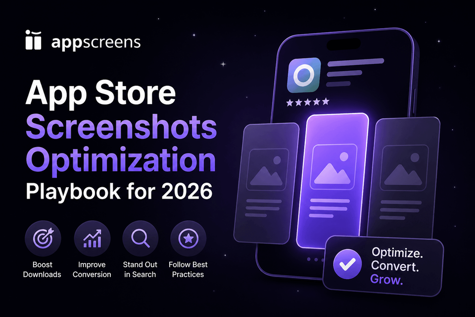
App Store Screenshot Optimization: Exact Workflow, Examples, and Testing Playbook for 2026
Screenshot ASO matters because many visitors decide before they read much copy: published ASO sources cite 37% of iOS product page sessions not scrolling below the fold, 90% of users not scrolling past the third screenshot, and only about 15% of iOS users scrolling through the full description.
Raw screenshots are important source material, but uploading them as-is can cost conversions. They show the interface, but they do not always sell the outcome, explain the benefit, create visual hierarchy, localize the pitch, or give visitors a clear reason to install.
Use this playbook to make your first screenshots do more selling: sharpen the first-frame promise, turn the first 3 screenshots into a clear story, keep captions readable, check Apple and Google Play rules, localize priority markets, and test variants. Build the final set in AppScreens when you need templates, AI-assisted captions, text fitting, per-language assets, store-ready exports, uploads, localization, variants, and one editable project for future updates.
Quick Take
App Store and Google Play screenshot optimization means making the first screenshots answer three questions fast: what does this app do, why should I believe it, and why is it worth installing now. Lead with a specific outcome, show real UI proof, keep one idea per screen, and adapt the message for important markets.
This guide shows you what to fix first: first-frame promise, screenshot order, benefit-led captions, Google Play and App Store rules, localization, and testing. When you are ready to build the finished set, use AppScreens to start from AI onboarding, templates or from-scratch design, real app screens, captions, previews, then export or upload store-ready assets from one editable project.
Why screenshot ASO matters
That is the practical reason to spend time on screenshots. The first frame and first-three story need to sell the outcome before users scroll, compare alternatives, or rely on the long description to understand the app.
- The first three screenshots do the heavy lifting: 37% of iOS product page sessions do not scroll below the fold, 90% of users do not scroll past the third screenshot, and only about 15% of iOS users scroll through the full description. Test screenshot 1, first-three order, caption angle, and visual proof before long-description copy.
- Testing makes the upside concrete: public ASO examples range from about +4% to +61%, and a +15% win is roughly 1,500 extra downloads at 10,000 monthly downloads. Published screenshot benchmarks cite a median winning lift around +11.8% conversion, and Rovio reported +13% conversion with about 2.5M additional installs from screenshot and creative testing.
- Localization can change the ceiling: public examples report +101% to +128% more downloads, and screenshot-localization examples report +33% to +36% conversion gains. Use the localization download lift guide to estimate the upside.
- Even routine screenshot updates can move results: cited around +6% downloads on iOS and +9% on Google Play when the new creative makes the app clearer.
The production catch is real: captions stop fitting, localized layouts need rebuilding, per-language screenshots or images cannot be swapped cleanly, store sizes need re-exporting, cloned files fall out of sync, and simple future changes become repeated edits across many assets. AppScreens keeps that work in one editable project with templates, captions, text fitting, per-language assets, store-ready exports, uploads, localization, variants, and future updates.
Build the finished screenshot set in AppScreens
Once the screenshot story is clear, use AppScreens to build the finished set without starting from a blank canvas. Start with AI onboarding, pull in app metadata, choose a ready-to-go template or start from scratch, upload real app screens, generate or edit benefit-led captions, preview sizes and languages, then export or upload store-ready App Store and Google Play assets.
The same editable project keeps screenshot work reusable when the job grows: localization, PPO and CPP variants, Google Play experiments, uploads, and future releases. That matters because one caption change can otherwise create repeated text fitting, export, upload, and QA work across sizes, languages, and variants.
1. Select and draft
Use AI onboarding, app metadata, templates, and AI-assisted captions so the first draft does not start from a blank canvas.
2. Design and localize
Add real app UI, brand styling, AI translation, automatic text resizing, RTL support, per-language screenshots, per-language images, and variants.
3. Preview and export
Check sizes and languages, generate required App Store and Google Play files, then export or upload through App Store Connect and Google Play workflows.
This is built for app founders, marketers, ASO teams, designers, indie developers, agencies, and localization teams that do not want one caption change to become repeated edits across iPhone, iPad, Android, localized sets, CPP and PPO pages, Google Play experiments, export folders, and upload mapping.
What breaks by hand: captions stop fitting, localized layouts need rebuilding, per-language screenshots or images cannot be swapped cleanly, store sizes need re-exporting, cloned files fall out of sync, and simple future changes become repeated edits across many assets.
Eight screenshots across 3 device sizes and 12 languages becomes 288 files before PPO, CPP, or Google Play experiment variants. AppScreens keeps text fitting, per-language assets, store-ready exports, uploads, localization, variants, and future updates inside one editable screenshot project.
Need a fast first set? AppScreens is free to start: create one project, use AI mode, export up to 5 screenshots, and manually upload the files to App Store Connect or Google Play. About 60% of AppScreens exports happen in free mode, which shows how often developers use it for practical launch-ready screenshot work. Upgrade when speed matters across more screenshots, projects, uploads, localizations, variants, team workflows, or client work.
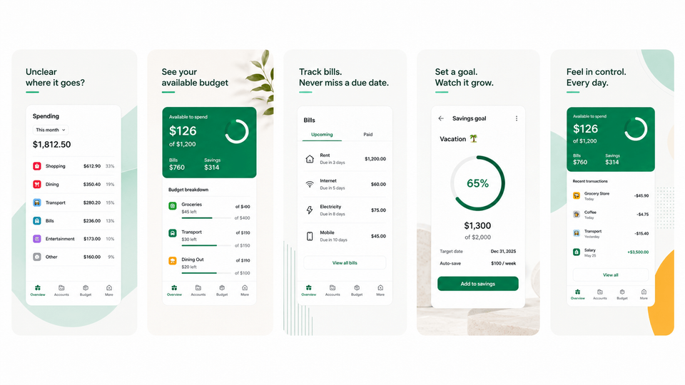
What should the first app screenshot show?
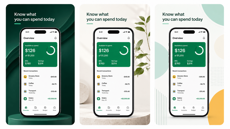
The first app screenshot should show the clearest user outcome, one believable piece of real app UI, and a short caption that still reads at preview size. Avoid broad claims like "best fitness app", "best budgeting app", or "best AI photo editor". A stronger first frame says "get this from that": get a calmer bedtime from a noisy evening, get a clear monthly plan from messy spending, or get a polished product photo from a cluttered image.
First screenshot formula
| Element | Use this rule | Example |
|---|---|---|
| Outcome | Lead with what the user gets. | "Plan a week of workouts in 60 seconds." |
| Pain removed | Show the before-state you fix. | Messy expenses, scattered tasks, photo clutter, or travel planning overwhelm. |
| Real UI proof | Make the app screen visible enough to prove the promise. | A readable budget forecast, workout plan, editor preview, or itinerary view. |
| Concrete unit | Use a time, quantity, place, or workflow cue. | "7 minutes", "12 workouts", "Tokyo day plan", or "next payday". |
| Audience or moment | Write for the searcher who needs that result now. | A founder, traveler, student, creator, parent, or team lead with one clear job. |
| Simple caption | Keep the copy readable at thumbnail size. | Remove anything that competes with the main promise. |
The first screenshot should do three things quickly: name the outcome, show real UI proof, and stay readable in preview.
The practical rules are simple: lead with the clearest outcome, show real app UI, keep one idea per screenshot, make the text readable at preview size, localize important markets, and test meaningful variants instead of tiny design preferences.
Weak first frame: "Powerful budget tracker."
Stronger first frame: "Know what you can spend before payday."
Why it works: The stronger version names the user outcome, implies the pain removed, and gives the UI a clear job: prove the forecast is real.
In AppScreens, start with app screenshot templates that already frame the outcome, proof, and caption hierarchy, then replace the placeholder screens with real UI so the first screenshot feels specific to your app. Templates should speed up hierarchy, spacing, and export structure, not make every app look the same.
What makes app screenshots convert?
A converting screenshot makes the right visitor think, "this is for me" before they lose interest. Start with the moment a visitor is judging your app. They are usually asking five questions without reading carefully:
- Is this for me? Match the problem, desire, audience, or use case.
- What do I get? Lead with the end result, not a feature label.
- Can I believe it? Show real UI, specific outcomes, recognizable flows, or product proof.
- How hard is it? Reduce effort with a simple flow, time cue, or before-and-after sequence.
- Why now? Remove the specific doubt blocking install: setup effort, privacy risk, pricing confusion, data import, or time to first result.
A converting screenshot set answers five questions fast: fit, outcome, proof, effort, and urgency.
That is the screenshot conversion job. Your first three frames should do most of the work: hook the right person, show the promised outcome, then prove the app can deliver it. Later frames can explain secondary features, setup, trust, localization, or objections.
| Weak screenshot | Better screenshot | Why it works |
|---|---|---|
| "Analytics dashboard" over tiny UI. | "See which campaigns drive installs" over a readable campaign report. | The caption names the outcome and the UI proves the report exists. |
| "AI tools" over a generic editor screen. | "Remove a background in one tap" over the edited result. | The screenshot shows a specific before-to-after result. |
| "Trip planner" over a menu screen. | "Plan each day of your Tokyo trip" over an itinerary view. | The message connects the feature to a real travel job. |
The better version names the outcome, proves it with real UI, and gives the visitor a reason to keep looking.
What should you optimize first?
- If users do not understand the app: fix the first screenshot promise.
- If users understand but do not care: rewrite feature labels as benefit-led captions.
- If the screenshots look polished but conversion is flat: test order, first-frame angle, and proof.
- If international traffic underperforms: localize captions, UI examples, currencies, names, and screenshots.
- If updates are slow: move the set into AppScreens so captions, text fitting, store sizes, per-language assets, exports, uploads, and variants stay connected.
Write your screenshot story like a mini sales page
Great ASO screenshots do not show screens. They sell outcomes, then use screens as evidence.
Outcome-led screenshot copy examples
- Fitness: "Finish a 12-minute strength workout at home" beats "Workout library."
- Budgeting: "See next month's cash gap before payday" beats "Budget tracker."
- Travel: "Build a day-by-day Tokyo plan in minutes" beats "Trip planner."
This is where AppScreens should be used as the source project: write the hook, promise, hero feature, and trust cue first, then keep each caption, UI image, localized version, export, upload file, and future variant connected so cloned files do not fall out of sync after one caption, screenshot, language, or test variant changes.
A strong screenshot set works like a storyboard: lead with the user’s situation, show the promised outcome, then use your UI as evidence. App Radar frames screenshots as a way to narrate your app’s story and create a clear impression of features and functionality. [6] In practice, that means writing for the user's situation instead of walking frame-by-frame through features.
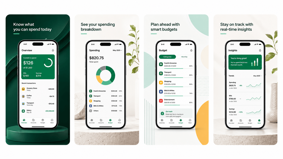
The 8-frame arc
- Hook: name the user problem or desire.
- Promise: show the specific result or before-to-after.
- Hero feature: prove the fastest visible win.
- Trust: show product proof, privacy, accuracy, or control.
- How it works: reduce uncertainty with a simple flow.
- Secondary value: add one useful extra feature or use case.
- Objection: handle setup, privacy, cost, compatibility, or effort.
- Close: repeat the benefit, not a pushy install CTA.
If you cannot explain why each frame exists, remove it.
AppScreens fits this storyboard step by keeping each frame tied to its own caption, UI image, and proof point, so you can revise the hook, promise, or trust cue without re-exporting every size, rechecking every locale, and remapping every variant by hand.
Where measurement fits
Screenshots influence two conversion moments: whether users stop from search or browse, and whether they install after viewing the product page. Use metrics to diagnose which moment changed, but use the screenshot story to decide what to improve.
How screenshots affect the store funnel
Screenshots are not the only conversion asset, but they are the main visual proof system on the listing.
Search or browse
Make users stop and understand the outcome.
Improve: first screenshot promise and preview readability.
Product page
Build confidence to install.
Improve: screenshot order, proof, and trust cue.
Testing
Learn which story converts.
Improve: one meaningful variant at a time.
Screenshots affect the funnel by turning store impressions into curiosity and product page views into confidence.
Design rules that make your message readable in two seconds
Your design job is not to decorate screenshots. It is to make the story legible at phone size, at speed.
Strong screenshot sets usually share the same traits: a tight palette, a small set of text styles, deliberate negative space, and consistent layout. These choices make your screenshot message readable in search, browse, and product-page previews.
The practical screenshot rule:
One screenshot equals one idea.
Not one feature list. Not one bundle of claims. One idea.
Screenshot readability checklist
- Can the headline be read at preview size?
- Is there only one idea?
- Is the UI large enough to prove the caption?
- Does the caption explain a benefit?
- Is there enough empty space around the message?
- Does the localized version still fit?
- Does the frame still make sense without the rest of the set?
Here is a visual of what that difference looks like in practice.
Focused vs cluttered screenshot mockups
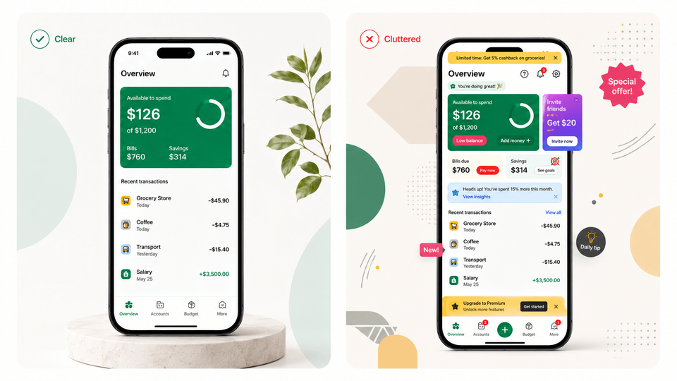
A practical set of design rules that survive both stores:
- Use a strict visual hierarchy so the user can read the headline first, then understand the app UI.
- Make the headline big enough to read on the smallest preview and keep it short, usually one clause. If the headline wraps into three lines, you are arguing with the user’s thumb.
- Give captions and UI breathing room so neither the mockup nor the message has to fight for attention.
- Keep type, device framing, backgrounds, and spacing consistent across the set so it feels like one story.
One more rule that often gets missed: if your UI is consistent across device sizes and localizations, Apple says you can upload only the highest resolution screenshots and they will scale down automatically. [7] That is useful because you can polish one set, then add device-specific screenshots only when captions, UI crops, or localized layouts genuinely differ.
AppScreens turns resizing into an export step instead of a redesign task: keep captions, device sizes, translated text, per-language screenshots, per-language images, variants, and upload files connected in one editable project.
How to optimize Google Play screenshots
Google Play screenshot optimization means making the first 3 screenshots clear enough to work in search, browse, and the full store listing. Show real app UI, avoid install CTAs, pricing claims, rankings, and unsupported promotional text, localize overlay copy, and keep taglines short.
Use AppScreens to create Android screenshot sets with benefit-led captions, accepted sizes, localized variants, store-ready exports, and Google Play workflows from one editable project. Pair the set with the Google Play feature graphic generator when the listing also needs a 1024 x 500 feature graphic.
Apple vs Google Play screenshot rules
Use this table before you storyboard, localize, or export. The platforms reward the same core work, but the upload limits, media order, testing tools, and text guidance change how you should plan each screenshot set.
| Area | Apple App Store | Google Play | What to do |
|---|---|---|---|
| Screenshot count | Up to 10 per device type. | Up to 8 per device type. | Build a strong 6 to 8 frame story first, then check iOS screenshot sizes and Google Play screenshot sizes before export. |
| Media order | App previews appear before screenshots when uploaded. | Screenshots appear after video when a video is present. | Make the first visible media and first screenshot share the same promise. |
| Testing tools | Product Page Optimization. | Store Listing Experiments. | Test first-frame promise, screenshot order, hero feature, and localization. |
| Custom pages | Custom Product Pages. | Custom Store Listings. | Match screenshots to campaign, audience, keyword, or locale intent. |
| Screenshot text guidance | Text overlays are commonly used, but should stay truthful and readable. | Text overlays must be restrained, readable, and compliant. | Keep captions short, benefit-led, localized, and policy-safe. |
| Video impact | App preview poster frames can shape the first media impression. | Preview videos can move screenshots later in the media sequence. | Make video poster frames and screenshots feel like one coherent story. |
| Localization | Localized screenshots and previews matter for what users see. | Overlay text and custom listings need localization. | Localize examples, captions, UI, currencies, names, and cultural cues. |
| Compliance risks | Screenshots should match the submitted app experience. | Screenshots must reflect real functionality and avoid misleading proof. | Use real UI, accurate claims, and store-safe proof to avoid screenshot and metadata rejections. |
The platform differences mostly change limits, ordering, testing, and export requirements. The core screenshot story should stay consistent.
Google Play screenshot planning has a few practical rules: screenshots can appear in search and home surfaces, the first 3 screenshots should prioritize real app UI, taglines should only be used when needed and stay under 20% of the image, overlay text should be localized, and screenshots should avoid install CTAs, pricing or promotional claims, rankings, accolades, and Google Play performance claims. [8]
Google Play screenshots do not work alone. If the app also needs a stronger Play Store visual package, pair the screenshot set with a clear feature graphic. Review Google Play feature graphic examples for the message, then use the Google Play feature graphic generator to create the 1024 x 500 asset, then keep the message aligned with the first screenshots.
Two platform mechanics that change how you prioritize assets:
Apple states that app previews always appear before screenshots on iPhone, iPad, Mac, and Apple TV, even if you reorder media. [7]
Google states that screenshots can show up across Google Play surfaces (like search or the homepage), and when a preview video is present, screenshots appear after it. [8]
If you use a preview video, make the poster frame and first screenshot repeat the same promise. Use the app previews vs screenshots guide to decide when video should lead, then treat the poster frame as part of the same visual system as the screenshot set so users see one coherent story instead of disconnected assets.
Make it measurable with experiments, not opinions
Your screenshots are a hypothesis. You should treat them like one.
A/B testing sounds simple until every new style, caption, order, PPO and CPP screenshot variant, or Google Play experiment needs new assets. AppScreens makes those variants easier to create, localize, export, upload, and reuse from one editable screenshot project.
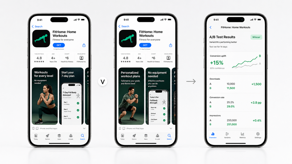
Apple’s Product Page Optimization lets you compare variants of app icons, screenshots, and app previews, test up to three alternate versions against your original, view results in App Analytics, and apply the winning treatment. Apple even suggests test ideas like highlighting culturally relevant content for a specific localization to see if downloads increase in that location. [2] Use the Product Page Optimization guide when you need to choose whether the first-frame promise, screenshot order, or app preview poster deserves the Apple test slot.
Google Play’s Store Listing Experiments are designed to run A/B tests on store listing text and graphics, and they promote localized experiments because users respond differently around the world. [10] In AppScreens, duplicate the Android screenshot set from the same source project so the control and variant keep matching sizes and locales, then use the Google Play Store Listing Experiments guide to run the Play test.
Before you test, duplicate the AppScreens project so the control and variant keep the same device sizes, locales, and export structure. For a deeper testing workflow, use our ASO A/B testing guide to estimate upside and decide whether a screenshot variant is worth the traffic.
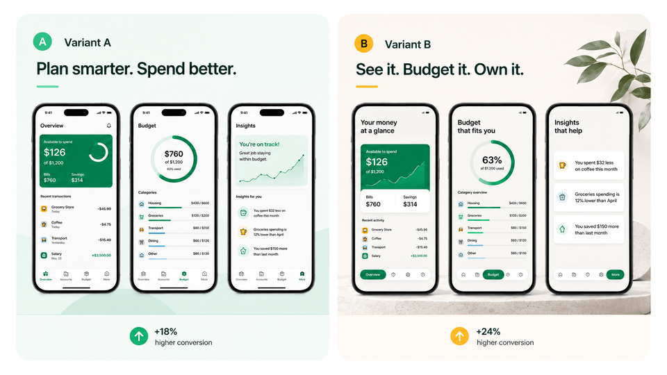
Testing priority table
| Priority | What to test | Why it matters |
|---|---|---|
| Test first | First screenshot promise | This is the fastest way to learn whether users understand the outcome you are selling. |
| Test first | Screenshot order | Reordering the first 3 frames changes what users learn before they scroll. |
| Test first | Hero feature | Different features can prove the same promise with very different levels of effort and trust. |
| Test first | Audience angle | A student, parent, team lead, or creator may need a different first-frame reason to care. |
| Test first | Localization | Market-specific wording, examples, and UI can change relevance more than a direct translation. |
| Test first | Trust cue | Privacy, integrations, real workflow proof, or result screens can reduce risk before install. |
| Test first | Caption style | Benefit-led captions often beat feature labels because they explain what the user gets. |
| Do not test first | Tiny color changes | Small color differences usually need more traffic than most listings have. |
| Do not test first | Minor gradients | Gradient polish rarely teaches you whether the screenshot story is stronger. |
| Do not test first | Decorative device mockups | A prettier frame is less important than the promise, UI proof, and first-three sequence. |
Prioritize tests that change the message users understand before testing small visual polish.
Example first test
Control: "Workout programs for everyone."
Variant: "Build a 4-week strength plan around your schedule."
Hypothesis: A more specific first-frame outcome will improve install conversion.
Metric: Install conversion rate in Product Page Optimization or Store Listing Experiments.
A clean testing protocol for screenshot sets:
- Write a single hypothesis. Example: "Leading with the outcome phrase will increase installs."
- Change one thing. Reorder, rewrite a headline, swap a background style, or replace one UI screen.
- Pick a primary metric. For Apple: conversion rate as Apple defines it in App Analytics. [3] For Google: listing visitors to installs within Play Console reporting, often surfaced in experiment results.
- Run localized tests when possible. Google explicitly encourages localized experiments, and Apple suggests localization-specific treatments.
- Ship the winner, then repeat. Many teams stop after one test and call it optimization.
The payoff can be meaningful even with small changes. Sensor Tower reported one case study where reordering App Store screenshots to put a key feature first lifted installs by 6.4% compared to the control. [11] The moral is not "always put Feature X first." The moral is: order is part of the message, so test it.
One Apple-specific operational detail: Unless you use Product Page Optimization[2], you must create a new version to update screenshots. [7] That makes it even more valuable to storyboard carefully before you submit, and to queue "next test" assets early.
Common app screenshot mistakes
Use this as a quick self-audit before you export or start an A/B test. Most weak screenshot sets fail because the core message is unclear, the UI is too small, the proof is risky, or the set was never adapted for the store surface where users actually see it.
Policy and trust gotchas
Avoid screenshots that show unsupported features, stale UI, private user data, misleading rankings, price claims, install CTAs, incorrectly used platform badges, fake reviews, or benefits the submitted build cannot deliver. Store screenshots should sell the app, but they still need to match the real product experience.
| Mistake | Use this rule | Why it hurts conversion |
|---|---|---|
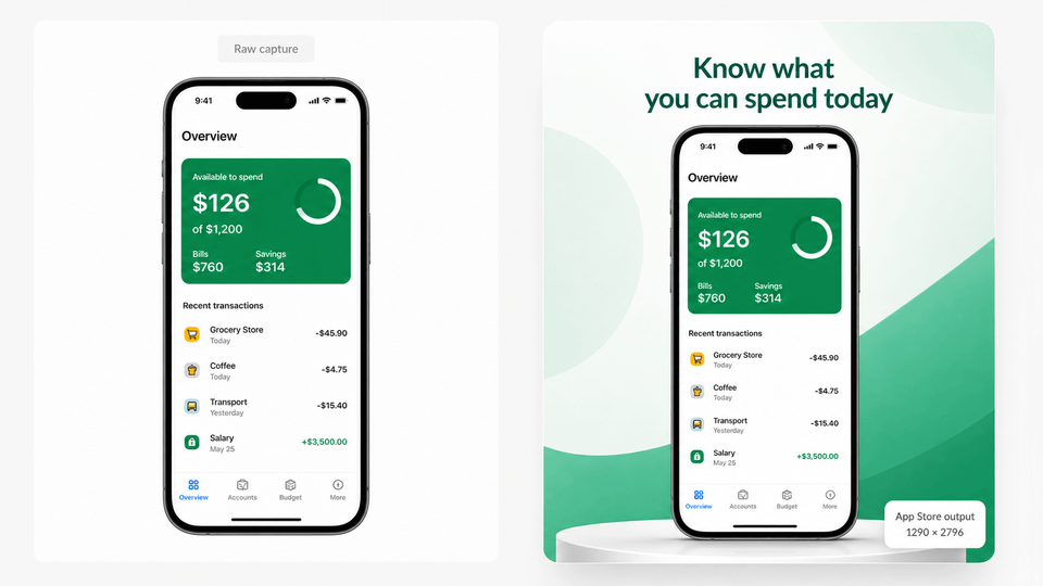
| Uploading raw captures as final creative | Use raw screenshots as source material, then add hierarchy, captions, and store-ready design. | Raw UI can prove the product, but it rarely explains the outcome or gives users a clear reason to install. |
| Using messy source captures | Capture clean app screens with current UI, no private data, no notifications, and a tidy status bar. Use the raw screenshot capture guide if the source screens need cleanup. | A polished template cannot fix confusing app states, personal data, stale UI, or distracting system chrome. |
| Showing tiny UI | Make the real app screen large enough to read in preview. | If the UI cannot be inspected, it cannot prove the caption. |
| Writing feature labels | Rewrite labels as benefit-led captions that say what the user gets. | "Analytics dashboard" is weaker than "See which campaigns drive installs." |
| Explaining 4 ideas in one screenshot | Use one message per screenshot and move secondary ideas later. | Crowded frames slow scanning and make the first 3 screenshots less persuasive. |
| Reusing English screenshots everywhere | Localize major markets with local UI, examples, captions, and proof cues. | Direct reuse makes the listing feel less relevant in high-value markets. |
| Adding unsupported awards or rankings | Check platform rules and the rejection guide before using awards, testimonials, ranking claims, or badges. | Unverified proof can create policy risk and weaken trust. |
| Waiting until export to check store rules | Design the story first, but check App Store screenshot sizes and Google Play screenshot sizes before final export. | Wrong dimensions, formats, crops, device sets, or Google Play text rules can create last-minute upload work. |
| Letting translated captions overflow | Check every key locale for line breaks, text length, and UI overlap. | Broken layouts make a localized listing feel rushed or untrustworthy. |
| Overpromising | Show only outcomes the current app can actually deliver. | Overpromising can buy low-quality installs while hurting ratings and retention. |
| Managing cloned screenshot files | Keep one editable project for captions, devices, localizations, variants, exports, upload mapping, and future updates. | Cloned files fall out of sync when one caption, screenshot, language, CPP/PPO variant, or Google Play experiment changes. |
Most screenshot mistakes come from one of four issues: unclear promise, unreadable UI, risky proof, or files that fall out of sync across captions, sizes, languages, variants, exports, and uploads.
Personalize by intent, locale, and campaign
Too many listings try to talk to everyone. Use store tools and campaign variants to make the first frames match the audience, market, keyword, or ad promise.
Apple custom product pages and Google Play custom store listings let you tailor screenshots by feature, audience, keyword, locale, URL, or ad campaign without creating a new app. [12][13] Use AppScreens to localize App Store and Google Play screenshots when the same campaign or keyword needs market-specific captions, UI examples, and export files.
Create a variant when the first frame should change.
- Search intent: match the keyword, problem, or category promise.
- Paid campaign: match the ad promise and landing-page angle.
- Locale: match language, examples, currency, names, and cultural cues.
- Feature: lead with one high-intent capability for a niche segment.
- Audience: change the hook for students, teams, creators, parents, or founders.
Localization is relevance, not just translation. Google recommends localizing overlay text where appropriate, and custom store listings need their own translations when you target languages or markets. [8][13] Apple also explains that missing localized previews can fall back to the next best available language. [7]
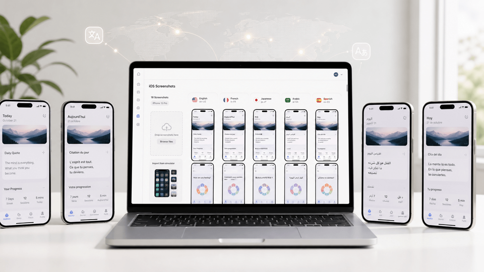
AppScreens treats localization as a versioned screenshot workflow, not a one-off translation task. Translate screenshots into 80+ languages with AI translation, support RTL languages, adjust longer captions with automatic text resizing, replace raw screenshots or images per language, then run the app screenshot localization checklist before export or upload.
Screenshot optimization workflow checklist
Use this checklist when you ship a feature, enter a market, launch a campaign, or prepare a screenshot test.
- Pick one audience and one job-to-be-done.
- Write the first-frame promise before opening a design tool.
- Storyboard 6 to 8 frames.
- Capture clean real UI and add benefit-led captions.
- Use real product proof for the promise.
- Check Apple and Google Play requirements.
- Localize important markets and create one meaningful test variant.
- Check text fitting, store-size files, upload slots, and locale or variant mapping, then export, upload, and keep the source project updated.
When you are ready to implement the workflow, use AppScreens to create app store screenshots from the same storyboard, then reuse that source project for text fitting, per-language assets, variants, store-size exports, upload mapping, and future updates.
Want a faster first draft? Use the free AI prompt to generate screenshot titles, subtitles, frame order, and suggested app screens. Then refine the final set in AppScreens with real UI, text fitting, per-language assets, variants, store-ready exports, and uploads.
Screenshot script template
Fill this in before design. The goal is to make every screenshot earn its place before you start choosing templates, colors, devices, or backgrounds.
## Screenshot set script (v1)

Target audience:
Primary intent keyword(s):
Primary objection to address:
Concrete unit to anchor value (full set, release, localization rollout, variant):

Frame 1 (Hook: problem or desire)
Headline:
What the UI shows:
Proof inside the UI (if any):

Frame 2 (Promise: outcome)
Outcome headline (include a unit or time cue):
Before → after phrasing (one line):
What the UI shows:

Frame 3 (Hero feature: fastest win)
Headline:
What the UI shows:
What makes it faster/easier than alternatives:

Frame 4 (Trust: reduce risk)
Headline (policy-safe for the store):
What the UI shows:
Privacy/security/support cue (only if true):

Frame 5 (How it works: 3 steps)
Headline:
UI screenshot(s) to use:

Frame 6 (Secondary value)
Headline:
What the UI shows:

Frame 7 (Objection handler)
Objection:
Headline:
What the UI shows:

Frame 8 (Close: benefit reminder)
Headline (no "Install now" style CTA on Google Play):
What the UI shows:
Free AI prompt for screenshot copy
Use this prompt to create a first draft of the screenshot order, captions, and suggested app screens. Then check every claim against real app capabilities before you design or export the screenshots.
Act as an ASO screenshot copywriter.

Create App Store and Google Play screenshot copy for this app:

**App Store title**: [CookBook Manager]
**App Store description**: [CookBook can import recipes from TikTok, Instagram, YouTube and more, in a single click]
**Unique selling points**: [Customize recipes with AI]
**Key selling points**: [Import from social media (Instagram, TikTok, YouTube), read recipe from voice or video]
**Style**: [Modern, fun, friendly]

Write an ordered 6 to 8 screenshot set that follows this structure:
1. Hook: clearest user outcome
2. Promise: specific result or before to after
3. Hero feature: fastest visible win
4. Trust: proof, privacy, accuracy, or confidence cue
5. How it works: simple 3-step flow
6. Secondary value: useful extra feature
7. Objection handler: remove doubt, effort, risk, or setup concern
8. Close: benefit reminder, not a pushy CTA

Rules:
- Lead with benefits, not feature labels.
- Use one idea per screenshot.
- Make the first 3 screenshots do most of the conversion work.
- Titles must be short, clear, and readable at mobile preview size.
- Subtitles must support the title with proof, speed, ease, or context.
- Use real app capabilities only. Do not invent awards, rankings, ratings, testimonials, numbers, or features.
- Avoid vague words like powerful, simple, next-generation, best, and all-in-one unless made specific.
- Avoid "Install now" or direct download CTAs, especially for Google Play.
- Match the requested style.

Return a table with:
Frame | Screenshot job | Title | Subtitle | Suggested app screen to show
At export time, keep AppScreens as the editable project that maps device family, locale, size, and variant naming. If App Store Connect rejects an asset, use the troubleshooting guide to fix App Store screenshot size errors before one wrong file turns into repeated exports across sizes, locales, CPP/PPO variants, or upload slots.
Create store-ready screenshots in AppScreens
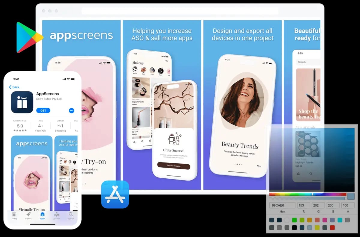
Turn your storyboard into polished App Store and Google Play screenshots from one editable project. Use AI onboarding, templates, benefit-led captions, 80+ localizations, test variants, store-ready exports, and App Store Connect or Google Play upload workflows. Trusted by 100,000+ app professionals with 10M+ screenshots exported.
FAQ
What is app store screenshot optimization?
App store screenshot optimization improves screenshot messaging, order, layout, localization, and visual proof so more store visitors understand the app and install. AppScreens turns this into a fast ASO screenshot workflow: use AI onboarding, pick a ready-made template, add benefit-led captions, import real app screens, preview sizes and languages, then export or upload store-ready assets from one editable project.
Is AppScreens good for one-off app screenshots?
Yes. AppScreens is fast for one-off App Store and Google Play screenshot sets. AI onboarding can find the app, templates help avoid a blank canvas, AI captions help with messaging, and users can export store-ready files. Free users can create one project, use AI mode, export up to 5 screenshots, and manually upload the files; paid plans add uploads, localization, variants, and scale.
How many screenshots should I use?
Use enough screenshots to tell a complete conversion story, not simply the maximum number available. Apple supports up to 10 screenshots per device type, while Google Play supports up to 8 per device type. Check App Store screenshot sizes and Google Play screenshot sizes before export. A strong set often uses 6 to 8 frames: hook, outcome, hero feature, proof, how it works, secondary value, objection handling, and close.
Why does ASO matter for screenshots?
ASO matters because screenshots sit close to the install decision. First-screen benchmarks cite 72% of iOS product page sessions ending without scrolling, 90% of users not scrolling past the third screenshot, and only 1% reading the full description across SplitMetrics experiments. Screenshots do not work like keyword fields, but they influence whether users tap from search or browse, understand the product page, and install. Use the ASO testing guide to estimate upside before creating variants.
What should the first app screenshot show?
The first app screenshot should show the clearest user outcome and enough real UI to prove it. Avoid splash screens, vague claims, and tiny interface shots that do not explain why the app is worth installing.
What should I optimize first?
Start with the first screenshot promise if users do not understand the app. Rewrite feature labels as benefit-led captions if users understand but do not care. Test order, first-frame angle, and proof if the screenshots look polished but conversion is flat. Localize captions, UI examples, currencies, names, and screenshots if international traffic underperforms. Use AppScreens when updates become repeated edits across captions, text fitting, store sizes, per-language assets, exports, uploads, and Custom Product Page variants.
What are the biggest app screenshot optimization mistakes?
The biggest mistakes are uploading raw captures as final store creative, using messy source screenshots, writing feature-label captions, showing tiny UI, ignoring Google Play and App Store export rules until the end, letting translated captions overflow, overpromising, and managing cloned files instead of one editable source project. Start with clean app screens, write benefit-led captions, check store sizes and policies, use the rejection guide when claims or metadata are risky, localize carefully, and keep variants editable.
Should app screenshots show benefits or features?
Lead with benefits, then use features as proof. A good caption says what the user gets, while the UI shows how the app delivers it. AppScreens is useful here because AI captions help non-designers move from blank canvas to ASO-friendly messaging faster while keeping captions fitting, localized versions editable, store sizes exportable, and future language or variant changes connected.
Do I need different screenshots for iOS and Google Play?
Yes. The story can stay aligned, but each platform has different screenshot limits, device sizes, media order, feature graphic behavior, video behavior, and testing options. AppScreens keeps one source project editable while exporting store-specific assets. Use App Store screenshot generator for iOS and Google Play screenshot generator for Android.
How do I optimize Google Play screenshots?
Make the first 3 screenshots clear enough to work in search, browse, and the full store listing. Show real app UI, avoid install CTAs, pricing claims, rankings, and unsupported promotional text, localize overlay copy, and keep taglines short. Use the Google Play screenshot generator for Android screenshot sets and the Google Play feature graphic generator when the listing also needs a 1024 x 500 feature graphic.
Should I localize app store screenshots?
Yes for priority markets. Localize captions, UI language, examples, currencies, names, imagery, and cultural cues instead of only translating the same English screenshots. AppScreens supports 80+ localizations, AI translation, automatic text resizing, RTL support, and per-language screenshot overrides through its screenshot localization workflow.
Can I test screenshot ASO?
Yes. On iOS, test screenshots, app previews, and icons with Product Page Optimization. On Google Play, test screenshot sets, feature graphics, localized creative, and listing text with Store Listing Experiments. Create one clear variant against the current screenshot set, change one meaningful idea such as the first screenshot hook, screenshot order, caption angle, or localized message, then use AppScreens ASO variants so captions keep fitting, localized layouts remain connected, store sizes can be re-exported, upload files stay mapped, and winning versions remain reusable.
When should I update app store screenshots?
Update screenshots when the store promise, product proof, or user context changes. Common triggers include a major feature, conversion drop, paid campaign, new locale, rebrand, competitor shift, seasonal campaign, or meaningful rating change. Often the right move is to rewrite the first screenshot promise, reorder the first three frames, update the hero feature, or localize examples.
What is screenshot-first ASO?
Screenshot-first ASO is an optimization workflow where the screenshot narrative is planned before the rest of the listing is polished. The goal is to make the app value clear visually in the first few seconds, then use captions, UI evidence, localization, and testing to improve install conversion.
Why use AppScreens for screenshot optimization?
Use AppScreens when you want clearer screenshots to win more downloads, create assets quickly, avoid size guesswork, keep captions fitting, swap per-language screenshots or images, re-export store sizes, map upload files, and update future variants without repeated edits across many assets. AppScreens is fast for one-off launch screenshots and repeatable optimization because it combines AI onboarding, templates, AI captions, real app screens, text fitting, per-language assets, localization, store-ready exports, App Store Connect upload, Google Play workflows, and future updates in one editable project, while ASO variants are faster to create without rebuilding every size and language by hand. Start with templates or compare pricing when you need more screenshots, uploads, localizations, variants, teams, or client work.
Read on
If you are improving this workflow, these related AppScreens guides are useful next steps:
Sources
- Best practices for your store listing (Play Console Help, Google)
- Product Page Optimization (Apple Developer)
- Measuring app performance (Apple Developer)
- Average App Conversion Rate per Category [2024] (AppTweak)
- Conversion Benchmarks: Compare conversion rates with apps and games (AppTweak Help)
- Screenshot Guide (App Radar)
- Upload app previews and screenshots (App Store Connect Help, Apple Developer)
- Add preview assets to showcase your app (Play Console Help, Google)
- Deceptive Behavior (Play Console Help, Google)
- Store listing experiments (Google Play Console)
- Case Study: How A/B Testing Can Improve Your App’s Conversion Rates (Sensor Tower)
- Custom Product Pages (Apple Developer)
- Create custom store listings to target specific user segments (Play Console Help, Google)