
Google Play feature graphics
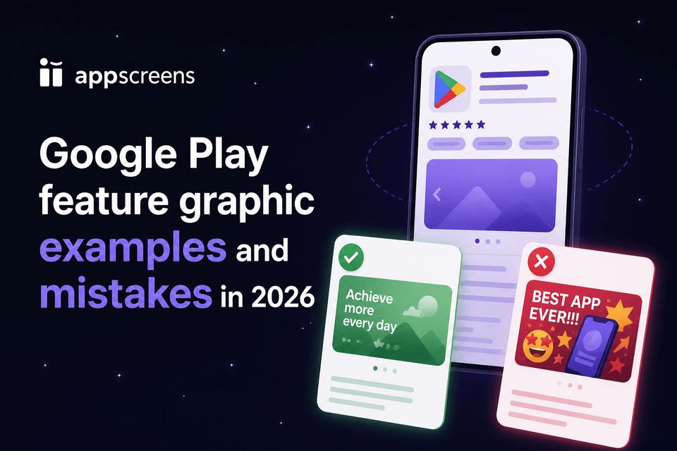
Google Play Feature Graphic Examples and Mistakes in 2026
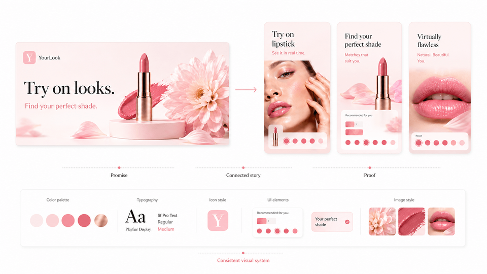
A Google Play feature graphic is required to publish your store listing. The best examples make one promise obvious in a 1024 x 500 image: what the app does, why it matters, and what the user should expect after tapping. Use a bold central visual, short readable copy, safe spacing from cutoff zones, and a style that matches your icon, app, screenshots, and preview video if you use one. For Google Play, the goal is not a decorative banner. It is a clear, compliant visual that helps users understand the app before they reach the screenshots.
The fastest repeatable workflow is the Google Play feature graphic generator in AppScreens: design the feature graphic alongside Android screenshots, tablet screenshots, localized variants, and Play Store experiment assets, then export or upload store-ready visuals from one editable project.
Treat the feature graphic as the first visual promise, not a resized screenshot. Use AppScreens when you need that promise to stay consistent across screenshots, localizations, campaign variants, Google Play experiments, and future app updates without rebuilding every asset by hand.
Quick Take
A Google Play feature graphic is a required 1024 x 500 asset that should make one app promise obvious fast. Use one central visual, short readable text, safe spacing from cutoff zones, and a style that matches the app icon, screenshots, and preview video cover.
The best examples work like compact posters, not resized screenshots. Avoid tiny UI collages, duplicated app-icon branding, edge text, ranking claims, store badges, stale seasonal graphics, and anything that will not read clearly on a phone.
Use AppScreens when you want to create the feature graphic alongside Google Play screenshots, localized variants, experiment assets, exports, and upload-ready files from one editable project.
What are feature graphics?
A Google Play feature graphic is the wide promotional image you upload in Play Console as part of your store listing graphics. You must provide one to publish your listing. Google can use it as the cover image for your preview video, except for Spatial Android XR videos, and in larger discovery surfaces such as collections, recommendations, and ads.
For apps, it can appear in large-format app collections, including ads. For games, it can appear in recommended game groups alongside preview videos and screenshots. Practically, it is the asset that connects your icon, video, screenshots, and short description. A good one gives users enough context to keep evaluating the listing. A weak one forces users to guess what your app is before they have reached the screenshots.
Use it to answer one question
If a user sees only this image for a second, what should they remember? For a meal planner, it might be "healthy meals planned for the week." For a budgeting app, it might be "know what you can spend today." For a game, it might be the core mechanic, world, character, or conflict.
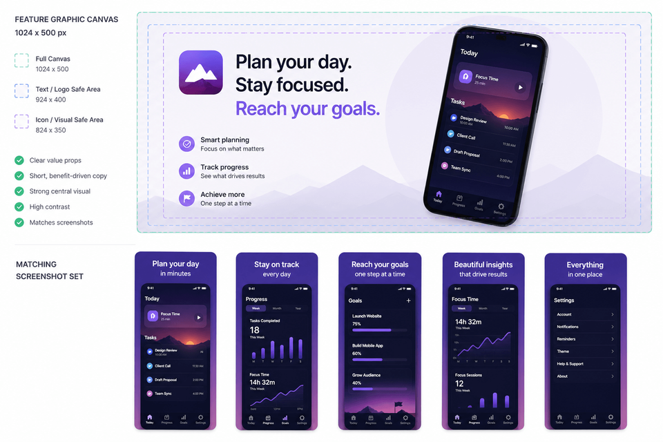
Size and role
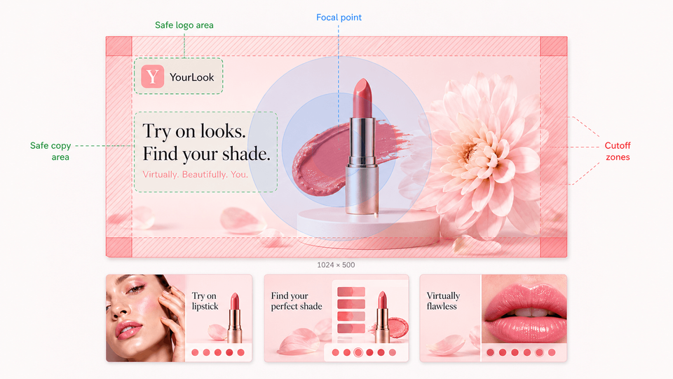
Google currently requires the feature graphic to be exactly 1024 x 500 pixels. The file must be JPEG or 24-bit PNG with no alpha transparency. Treat those specs as the export target, then design with extra practical constraints for cropping, overlays, small-screen readability, and accessibility.
Requirements last checked against Google Play Console Help on
| Item | Use this rule | Why it matters |
|---|---|---|
| Requirement | Feature graphic required | You must provide this asset to publish a Google Play listing. |
| Canvas | 1024 x 500 px | Play Console expects this exact feature graphic size. |
| Format | JPEG or 24-bit PNG, no alpha | Transparency can be rejected or render unpredictably. |
| Safe area | Keep key elements away from edges | Google surfaces may crop the graphic in different layouts. |
| Focal point | Keep prominent visuals near the center | Important logos, slogans, app names, and UI can be cut off in some formats. |
| Center overlay | Leave the middle visually resilient | A preview video can add a play button over the center. |
| Alt text | Describe the important content in 140 characters or less | Alt text helps screen-reader users understand the uploaded graphic. |
Google Play guidance checklist
Before uploading, check the graphic against Google Play's practical content guidance. The goal is not just to make a nice banner; it needs to stay eligible for the Play surfaces where Google may show it.
Keep the value central
Put the main UI, character, app name, slogan, or value proposition near the center. Restrict background texture, supporting art, and decorative details to the outer edges.
Avoid app-icon duplication
Do not make the feature graphic look like a larger version of your app icon. Use brand elements that extend the icon instead, because the icon may appear beside the graphic.
Use store-safe color
Use a vibrant or complementary color theme that matches the app and icon. Avoid pure white, pure black, and dark gray backgrounds because they can blend into Google Play surfaces.
Keep details readable
Avoid fine details, tiny UI, tiny text, and crowded collages. Many users will see the graphic on a phone screen where small elements disappear quickly.
Localize visible text
Localize the feature graphic and branding text for important markets. Check text length, line breaks, reading direction, and whether the example makes sense locally.
Write useful alt text
Add alt text for each uploaded graphic. Keep it under 140 characters and describe the important content, such as "Weekly meal plan screen with completed recipes." Do not start with "image of" or "photo of."
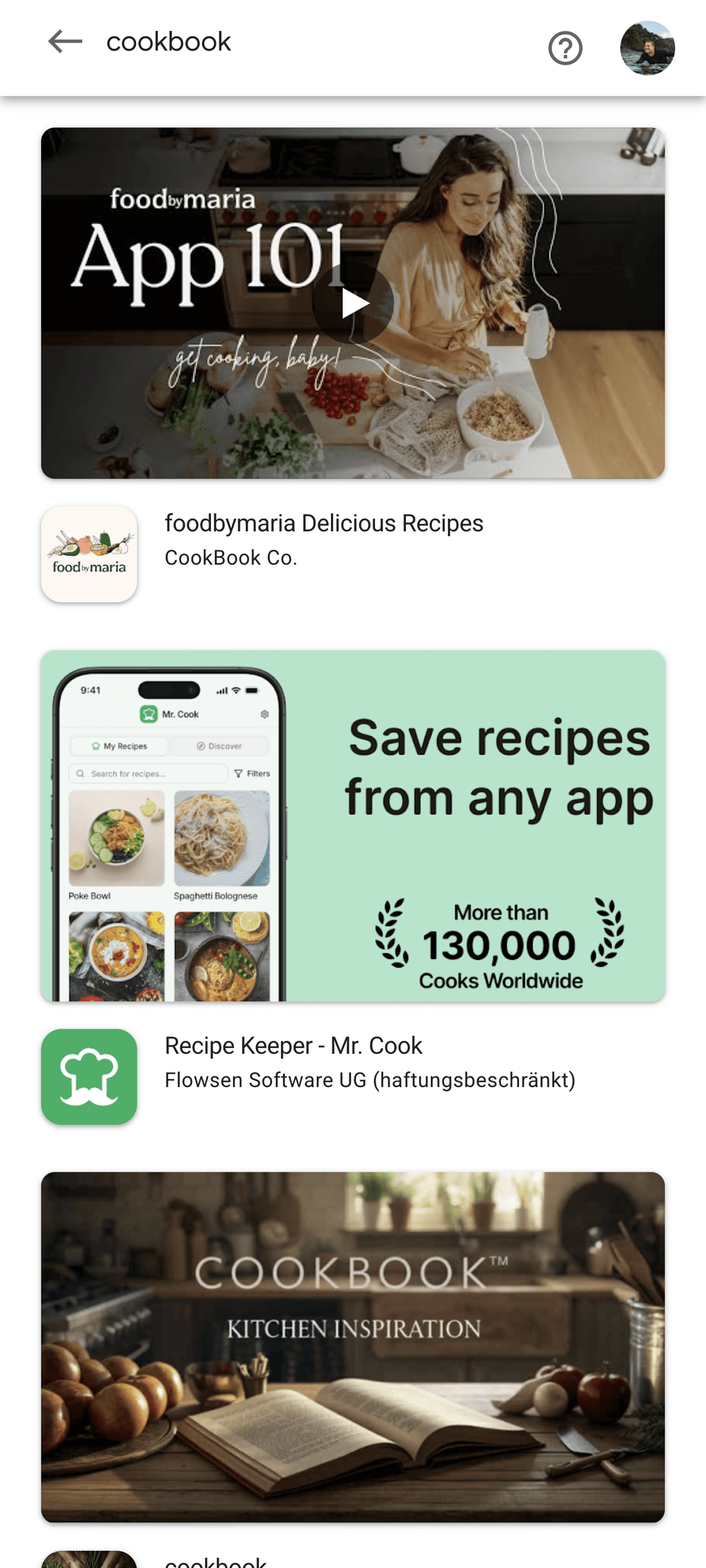
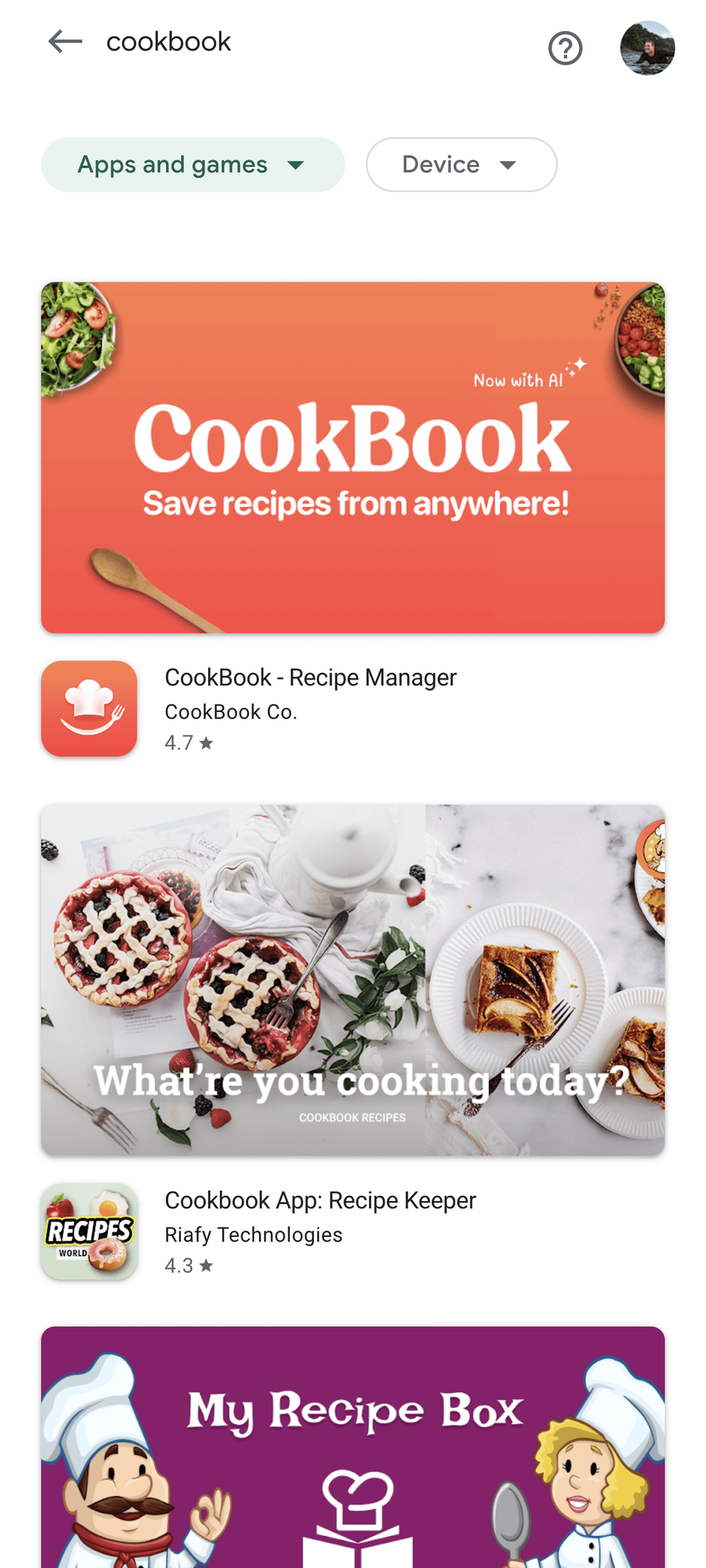
Feature graphic examples that work
Choose the example pattern based on what makes users install. If the app saves time, lead with the outcome. If the product is a game, lead with the moment of play. If the value is visual change, use before and after. If trust matters, use a calmer proof-led layout. If the campaign is temporary, make the expiration or event easy for the team to maintain.
- Utility apps: show the finished result or fastest win.
- Games: show character, action, world, mechanic, or conflict.
- Creative, fitness, photo, and cleanup apps: show transformation.
- Finance, health, privacy, and business apps: show control, clarity, and trust.
- Seasonal campaigns: use them only when the team can replace them before they become stale.
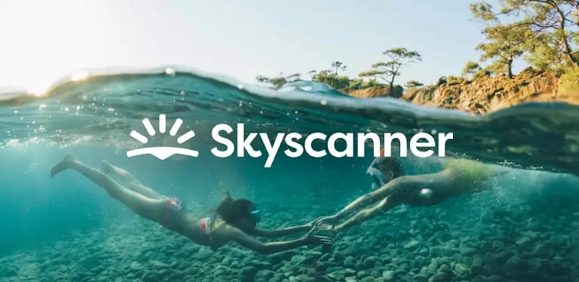
1. Outcome-first utility app
Show the result: a cleaned inbox, completed budget, booked appointment, or finished plan. Use one short phrase, such as "Plan your week in minutes."
Works because users understand the benefit before the UI details.
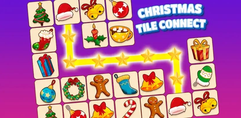
2. Gameplay moment
Show a real scene from the game: character, tension, environment, and action. Avoid a logo-only banner if the art or mechanic is what sells the game.
Works because genre and energy are visible instantly.
3. Before and after transformation
Best for editing, fitness, photo, home, learning, cleanup, and productivity apps. Use a split layout only when the change is obvious without explanation.
Works because the graphic proves change, not just features.
4. Lifestyle plus product proof
Use a person, place, or context beside a crisp UI moment. Good for travel, food, fitness, education, and wellness, where the real-world use case matters.
Works because it connects the app to a believable user situation.
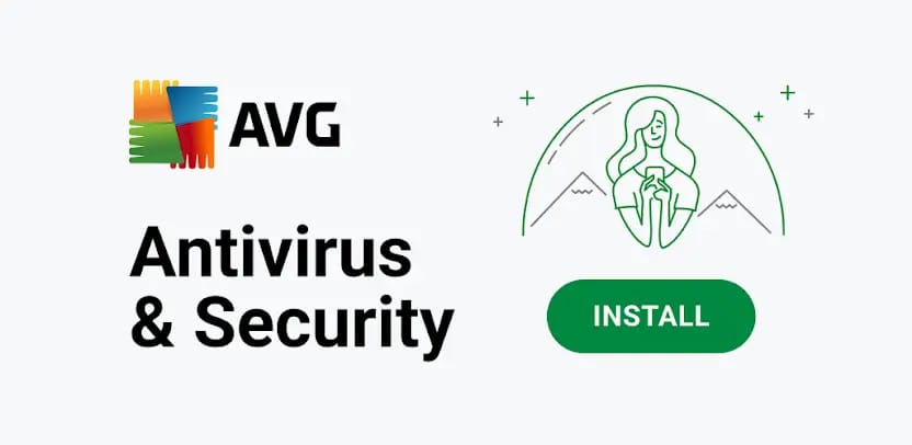
5. Trust-led app
For finance, health, privacy, and business tools, lead with clarity and restraint. Show the protected outcome, the clean dashboard, or a calm control state.
Works because the category needs confidence more than noise.
6. Seasonal or campaign variant
Use this for genuine events, launches, new content, or limited campaigns. Keep a calendar reminder to replace it before the event becomes stale.
Works when the offer is current and the operations team can maintain it.
Fastest workflow: create the feature graphic and Play screenshots in AppScreens
AppScreens is built for Google Play visual production: create a 1024 x 500 feature graphic, Android phone screenshots, tablet screenshots, localized variants, and Play Store experiment assets with one consistent brand system. Export pixel-perfect files or upload to Google Play from AppScreens when the release is ready.
The best feature graphic does not sit apart from the rest of the listing. It should reinforce the same promise as your first screenshot, preview video cover, short description, and campaign assets. AppScreens keeps that message system editable so teams can update, localize, test, export, and upload without rebuilding every layout by hand.
- Choose the one promise the feature graphic should make.
- Create the 1024 x 500 feature graphic in AppScreens.
- Build matching Google Play screenshots with the same visual system.
- Localize text, examples, screenshots, and image choices for priority markets.
- Create feature graphic or screenshot variants for Google Play experiments.
- Export or upload Play Store-ready assets from the same editable project.
Manual production scales quickly. One feature graphic plus eight screenshots across 9 locales becomes 81 assets before experiment variants, upload checks, and future update changes. AppScreens keeps the feature graphic, screenshots, localizations, variants, exports, and Google Play workflow in one project.
Workflow: create Google Play feature graphic assets
The easiest way to create Google Play feature graphic assets is to plan the image with the rest of the listing, not after the screenshots are finished. In AppScreens, that means using the same product message, visual system, and localization plan across screenshots and feature graphics.
Production checklist
Before export or upload
In AppScreens, review the feature graphic as part of the whole Play listing system before exporting. Check the 1024 x 500 canvas, center focal point, cutoff zones, video play-button overlay, localized text, matching screenshot style, alt text, and experiment variant naming before the asset goes into Play Console.
Common mistakes
| Mistake | Use this rule | Why it matters |
|---|---|---|
| Treating it as another screenshot | Design it as a poster asset. | If you paste three tiny phone screens into it, users may not understand anything at listing size. |
| Putting text near the edges | Keep the message comfortably inside the canvas. | Cropping can cut off letters, logos, faces, and UI. |
| Hiding the main message under the play button | Leave the center clear when you use a preview video. | A play button can sit in the center, so critical copy or a face underneath it may be hidden. |
| Repeating the first screenshot | Make the feature graphic reinforce, not duplicate, screenshot one. | The feature graphic and first screenshot should work together without showing the same exact frame. |
| Using a logo-only banner for an unknown app | Show context, use case, or product value. | Strong brands can sometimes rely on a logo, but most apps need to explain why users should care. |
| Leaving seasonal graphics live too long | Remove campaign graphics when the event ends. | A Valentine's, Black Friday, or launch-event graphic only helps while it is current; stale campaigns make the listing feel unattended. |
| Copying your app icon into a wide banner | Use the icon as context, not the whole graphic. | Google may show the app icon beside the feature graphic, so repeating it can make the listing look duplicated instead of designed. |
| Using banned or risky promotional claims | Avoid price, discount, ranking, testimonial, award, or performance language. | Claims such as "Best," "#1," "Top," "New," "Free," "Sale," or "Million Downloads" can create policy risk. |
| Adding third-party or store branding | Only include branding you have permission to use. | Third-party trademarked characters or logos, Google Play badges, other store badges, and obsolete device imagery can cause avoidable review problems. |
Text Rules
Text can help, but only when it is short enough to read and specific enough to add meaning. The app name, category, and short description already carry some context, so use the feature graphic copy for the strongest missing piece.
Good feature graphic text
- "Plan meals for the week"
- "Edit video in minutes"
- "Track spending before payday"
- "Build stronger study habits"
Weak feature graphic text
- "The best app ever"
- "Download now"
- "Number 1" without compliant proof
- A paragraph copied from the short description
Copy checklist
- Use one short line where possible.
- Make the phrase readable at thumbnail size.
- Localize the copy for important markets.
- Avoid pricing, ranking, badge, award, testimonial, or performance claims that may become non-compliant or outdated.
- Do not use "Best," "#1," "Top," "New," "Free," "Discount," "Sale," or "Million Downloads" as promotional hooks.
- Check that the same words do not repeat awkwardly in the title, short description, and first screenshot.
Alt Text for Feature Graphics
Google recommends alt text for each graphic asset. Write it for someone who cannot see the image, not as a keyword list. Keep it short, describe the important content, and skip phrases like "image of" or "photo of" because screen readers already announce that context.
Useful alt text
- "Weekly meal plan screen with completed recipes"
- "Puzzle battle scene with two characters attacking"
- "Budget dashboard showing safe-to-spend amount"
Weak alt text
- "Image of our app"
- "Feature graphic"
- "Best free app download now"
Feature Graphic vs Screenshot
The feature graphic and screenshots should work together, but they have different jobs. The feature graphic creates the first visual frame. Screenshots then explain the app in a sequence.
| Asset | Primary job | Best content | Mistake to avoid |
|---|---|---|---|
| Feature graphic | Set the visual promise quickly. | One hero idea, readable phrase, strong image. | Cramming in multiple tiny app screens. |
| Screenshot | Explain the app step by step. | Real UI, captions, benefits, proof, workflow. | Repeating the feature graphic instead of adding detail. |
Build your Google Play feature graphic in AppScreens
Create a 1024 x 500 feature graphic that matches your Android screenshots, localization plan, preview video cover, and Play Store experiment variants. AppScreens keeps the feature graphic, screenshots, exports, uploads, and future updates in one editable project.
FAQ
What is a Google Play feature graphic?
A Google Play feature graphic is a required 1024 x 500 promotional image used by Google Play to represent your app in preview video covers and larger discovery placements.
What size should a Google Play feature graphic asset be?
A Google Play feature graphic asset should be exactly 1024 x 500 pixels and exported as JPEG or 24-bit PNG with no alpha transparency.
Can I use text in a Google Play feature graphic?
Yes. Use short, large, readable text, keep it away from the edges, localize it for priority markets, and avoid claims that become non-compliant or outdated.
Should my feature graphic match my screenshots?
Yes. The Google Play feature graphic should feel like the same listing system as your screenshots, app icon, and app UI, but it should not duplicate the first screenshot exactly. AppScreens keeps the feature graphic and Google Play screenshots in one visual workflow.
How do I create Google Play feature graphic variants for testing?
Create one control and one clear treatment, change a single major idea such as message or visual focus, export both at 1024 x 500, then test them with Google Play Store Listing Experiments. Build the assets with the Google Play feature graphic generator and plan tests with the Google Play experiments guide.
What are common Google Play feature graphic mistakes?
Common mistakes include edge-cropped text, hiding key content under the video play button, repeating the first screenshot, using tiny app screens, duplicating the app icon, relying on pure white or dark gray backgrounds, using store badges or device imagery, and leaving seasonal graphics live too long.
What should I avoid in a Google Play feature graphic?
Avoid Google Play performance, ranking, testimonial, award, price, discount, sale, and download claims. Do not use third-party trademarked characters or logos without permission, Google Play or other store badges, or device imagery that becomes obsolete.
Do Google Play feature graphics need alt text?
Yes. Add concise alt text for each graphic asset. Keep it under 140 characters, describe the important content, and avoid starting with "image of" or "photo of."
How can AppScreens help create Google Play feature graphic assets?
AppScreens helps create Google Play feature graphics in the same workflow as screenshots. Use AI onboarding, templates, app screens, captions, brand styling, and the Google Play feature graphic generator to export a 1024 x 500 asset that matches the rest of the listing.
Can I make a Google Play feature graphic without a designer?
Yes. AppScreens gives non-designers a faster path than a blank canvas: start from app context, choose a ready-made template, keep the message short, match the screenshot style, and export the required 1024 x 500 file. Compare pricing if you also need uploads, localization, or variants.
Is a Google Play feature graphic required?
Yes. Google Play requires a feature graphic for the store listing. Treat it as part of the same conversion system as screenshots, not a separate last-minute banner. Use the Google Play feature graphic generator with the Google Play screenshot generator.
Read On
If you are improving this workflow, these related AppScreens guides are useful next steps: